The Denver Broncos’ new uniforms are so bad it’s the one thing everyone can agree on.
On Monday morning, the Denver Broncos released a two-minute video unveiling their newest set of uniforms that the team will don starting with the 2024 season. After a ton of b-roll focusing on the Colorado wilderness and clips of horses galloping alongside a Ford Bronco (a little on the nose, huh?) the video crescendo’d into the final dramatic reveal.
A new era forged by #BroncosCountry. pic.twitter.com/LaK3ZfsoZ9
— Denver Broncos (@Broncos) April 22, 2024
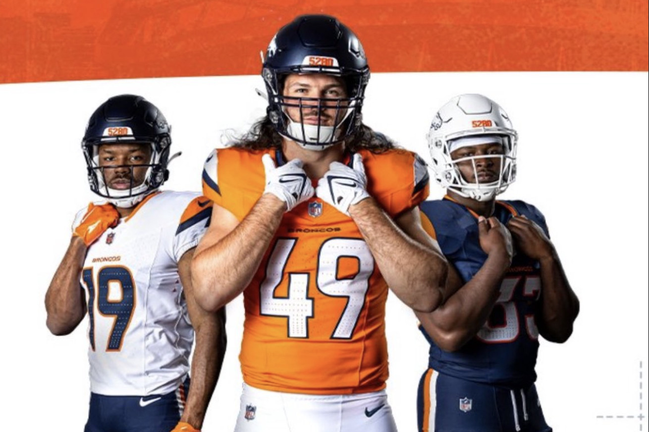
For those who do not wish to wait through the entire video above, here’s a clear look at the entire kit which features three different tops, three different bottoms, and both a navy and white helmet.
THE BRONCOS’ NEW UNIFORMS
( via @Broncos) pic.twitter.com/gdHrY9RC2c
— Zac Stevens (@ZacStevensDNVR) April 22, 2024
If your first reaction to the new threads is something along the lines of, “Those look familiar…,” then you’re not alone. Right away, these look far too similar to the uniforms of a number of college programs, including Virginia, UTSA, UTEP, and Syracuse. Heck, if you look at them from the right angle you can start to get some Blue Mountain State vibes, as well. Not long after the drop, the internet shared their immediate reactions, and they did not disappoint.
Here’s just a small taste of what has been said thus far:
These are… not good. Did Syracuse jump to the NFL? https://t.co/ujA182mtX0
— Busted Coverage (@bustedcoverage) April 22, 2024
Here comes UTEP! These are rough https://t.co/wwop9Z0Chv
— Matt Verderame (@MattVerderame) April 22, 2024
These look like the uniforms from a Disney movie about a hometown QB who lives his dream of playing for the Denver Broncos but they can’t use their real names and uniforms so they made these instead and called them the Denver Stallions or something. https://t.co/djayVRGcDd
— Myron Medcalf (@MedcalfByESPN) April 22, 2024
We have local high school teams with better uniforms https://t.co/85cmx24nTb
— McKenzie Nelson (@McKenzieMNelson) April 22, 2024
oh brother these STINK https://t.co/toNVBZGT6g
— Mike Golic Jr (@mikegolicjr) April 22, 2024
They put Broncos logos on the Fighting Illini unis and called it a day https://t.co/gXC0laV1IZ
— Dylan Bishop (@villainbishop) April 22, 2024
Besides the obvious similarities noted on above, these just don’t scream “professional football team” to me. If they did not have the Broncos logo on the helmet, I would have no idea what level of football I was looking at. The “mountain peak” on the shoulders looks no different than the bolt seen on the Chargers’ jerseys and the “5280” on the forehead is too clunky. It’s one digit too many, in my opinion.
Lastly, the decision to lose the helmet stripe is wildly confusing. Now it’s just a monochromatic helmet with little to no life/energy. I just don’t get it. More contrast means more “pop.” I couldn’t imagine trying to live the “Look good, feel good. Feel good, play good” mentality with these.
After all of this, however, the Broncos did manage to claw back some respect by revealing their new throwback jerseys based on the 1977 kits.
The ‘77 classics … are BACK! pic.twitter.com/xG8vtiC1Gf
— Denver Broncos (@Broncos) April 22, 2024
Now THESE should have been their new home uniforms. I don’t know how many times they’ll end up wearing them each season, but most throwback uniforms only see the sun once or twice a year. That’s a travesty for how great these look compared to their main kit.
The Broncos truly did not have a tall task with their re-design. They needed to utilize all of your inspiration from the team’s most popular uniform in franchise history and build the kit around it.
Simple, yet they ended up with this. An unfortunate day for Broncos Country.


