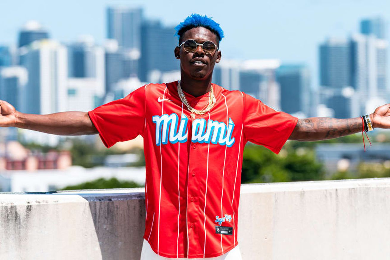
Let’s figure out the best and worst of the MLB City Connect uniforms.
During the 2021 MLB season, the league released City Connect jerseys, a way to shake up design of some of the more iconic brands around the world of professional baseball. While some have been spectacular, some have been, well, spectacularly bad. The Baltimore Orioles, Cincinnati Reds, Atlanta Braves, Seattle Mariners, Texas Rangers and Pittsburgh Pirates are the final teams to receive City Connect jerseys for 2023.
So through almost three years, which team has the best City Connect jersey? That’s what the tier list is for, baby! We’re going to be placing the jerseys into tiers, with S being the highest and F being the lowest, of course. Pittsburgh will not be included because we don’t know what their jerseys look like.
Without further ado, here we go! A reasoning for each jersey placement will be below the tier list.
S Tier: Already own the jersey/will be buying ASAP
Full disclosure: I already own this jersey and wear it often. I mean, the bright blue with the red, plus the history of the Cuban Sugar Kings makes it a slam dunk.
It’s hard to mess up black and white, but the lettering on the front really sets this one over the top. Just a super crisp and clean look for the White Sox.
This is the perfect example of how to do a City Connect jersey. you take something iconic from the city (like the cherry blossoms in DC), and you mold the jersey around it, without making it overbearing. I’d wear these instantly.
A Tier: Very good jersey, I’d buy it and wear it
Atlanta Braves
Yeah, these are cool. Inspired by the 1974 jersey the Braves wore when Hank Aaron broke the home run record, the Braves City Connect jersey works really well with the complementary colors. Sweet looking jersey with an awesome history.
Photo by Matt Thomas/San Diego Padres/Getty Images
I’m in with the neon looks, man. It might look like a can of Arizona iced tea but those cans look dope as hell. This one rocks.
I LOVE that they put the mountains on the jersey. It makes it stand out, and looks a lot different from the jerseys they already have. I’d buy this and like put it on my wall.
Photo by Evan Triplett/Houston Astros/MLB Photo via Getty Images
Maybe I’m just a big space nerd, but I like these a lot, man. The navy blue and the orange work well together, and it’s not too crazy but a fun jersey overall.
B Tier: Not my first choice, but a darn good second pick
You put script on a jersey, and I’ll wear it.
Baltimore Orioles
The Baltimore Orioles unveiled their City Connect uniforms featuring a patterned lining on the inside of the jersey — a first for MLB — meant to symbolize the city’s neighborhoods pic.twitter.com/9UlOsnlXUg
— Joon Lee (@joonlee) May 22, 2023
So, at first I thought the jerseys were kinda lame, but I think when they’re being worn, they look kinda cool. The pattern on the sleeves is nice, and I’d wear it. Might not be my first choice, but I’d wear it.
C Tier: “It’s on the rack, I guess I’ll buy it”
Seattle Mariners
Photo by Steph Chambers/Getty Images
I feel like these are just, ok. Like nothing too crazy stands out, but nothing is so bad it makes it godawful. Just a chill jersey, and I respect that.
Photo by Katelyn Mulcahy/MLB Photos via Getty Images
Again, it’s just fine. The font on the front is kinda cool, but nothing too crazy.
Texas Rangers
Photo by Bailey Orr/Texas Rangers/Getty Images
“Hey Angels, can we copy your homework?”
“Yeah, but don’t make it too obvious.”
So. Much. Blue
So. Much. Blue (Kansas City edition).
D Tier: Hey man, it’s on sale so maybe
Cincinnati Reds
These would be higher if you could actually see the lettering on the front. I like the idea, just bad execution.
These must be a pain to watch the Giants play in from the press box. The gradient is an interesting idea, but on the numbers is bleh.
F Tier: Not a chance in hell I’d wear it
…did they try? Like, seriously, did they try?
Photo by Maddie Malhotra/Boston Red Sox/Getty Images
I’m morally opposed to everything Boston, but also these are just very weird. I get the reason why, but this will never stick with me.


