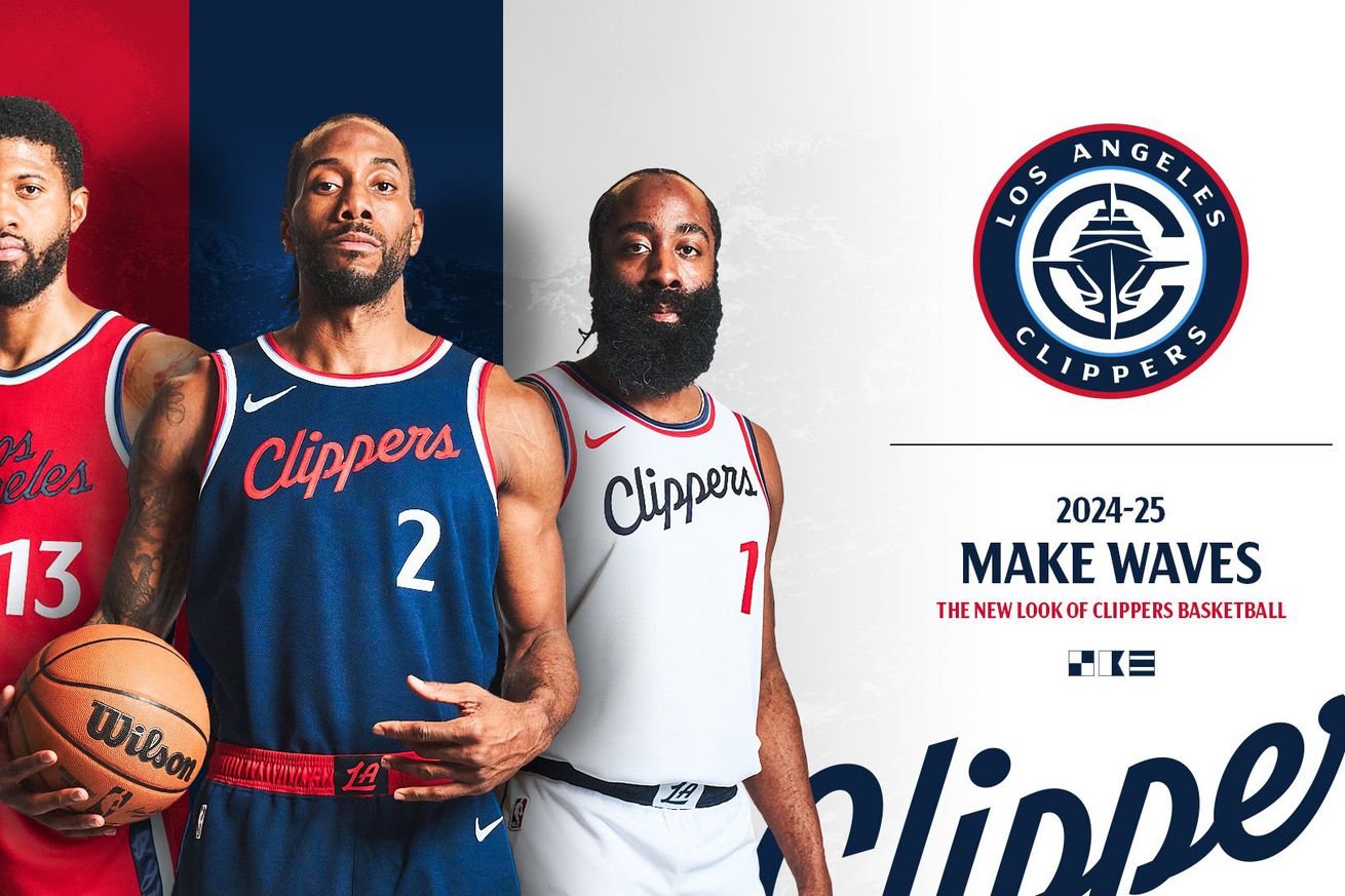
The Clippers’ new rebrand is a big improvement.
The Los Angeles Clippers don’t exactly strike fear into their opponents, historically-speaking. The franchise that was founded as the Buffalo Braves in 1970, became the Clippers in a move to San Diego in 1978, and then landed in LA in 1984, has never reached the NBA Finals. The franchise’s all-time winning percentage for both regular season and postseason games is 42 percent.
The Clippers have been decidedly more successful since Steve Ballmer purchased the team back in 2014. The “Lob City” era led by Chris Paul and Blake Griffin produced five consecutive 50+ win seasons. In 2019, the team made another big pivot by signing Kawhi Leonard in free agency and trading for Chris Paul. After adding James Harden in a trade this season, the Clippers are now a legitimate championship contender.
Since Ballmer bought the team, he’s had his eye on a major rebrand. The biggest piece of this will be a new building that the team can finally call its own, with the Inuit Dome opening next season in Inglewood. With the team set to move into its new arena, the Clippers unveiled a new rebranding on Monday that features a new logo, new uniforms, and the first image of their new court.
Meet your new look Los Angeles Clippers:
It’s clear that everything about the Clippers has been under evaluation since Ballmer bought the franchise. Ballmer heavily considered changing the team name, but the fanbase was “violently opposed” to ditching the Clippers’ moniker, according to ESPN.
Clippers executives cited the PSG logo for inspiration. “We studied a lot of franchises — but you look at the logo of PSG, Paris Saint-Germain, and there’s many people who wear that logo and aren’t even understanding that it’s a European football team,” Clippers president of business Gillian Zucker told The Athletic. “They just think it’s cool, and it represents a place they care about.”
It wasn’t hard to beat the Clippers’ current branding, which was hastily put together shortly after Ballmer bought the team. This is a big improvement.
The Clippers’ new uniforms are pretty good
Black is out the color scheme for the Clippers, at least for now. The team is going back to the red jerseys it wore throughout the ‘90s, while also having navy blue as a main color.
The Clippers are leaning into the nautical theme along the side of the jerseys.
The story behind the new Clippers logo
A clipper is a “a sailing vessel designed for speed.” LA is leaning all the way into it with its new logo.
One of the coolest parts of the logo is that the N points north. This will also be the case on the floor in the new arena.
Clippers’ rebrand reaction: What the internet is saying about Clippers’ new branding
For the most part, people like the Clippers’ new rebrand:
I love a good team rebrand. Clippers did a good job.
— QUAN (@QuannyNitro) February 26, 2024
The Clippers rebrand is very good overall and a big improvement over their current set. But clipper doesn’t just mean “any kind of boat” and making the logo into a superyacht is incredibly lame.
— Michelobius (@Michelobius) February 26, 2024
the new clippers logo looks like someone is aiming a rifle scope at a boat, which feels like the wrong energy when the boat is your team
— Ryan Nanni (@celebrityhottub) February 26, 2024
The new merch looks good, too.
New uniforms, a new building, and a new logo are all here for the Clippers. Is a championship on the way, too? For once, this franchise is actually trending up. These aren’t your father’s LA Clippers anymore.


