These are the best and worst of the 2022-2023 NBA City Edition jerseys.
The NBA City Edition jerseys have been released for the 2022-2023 season, and we got an interesting crop of jerseys this year. Some are remixed versions of their original City edition uniforms, while others went in a totally new direction.
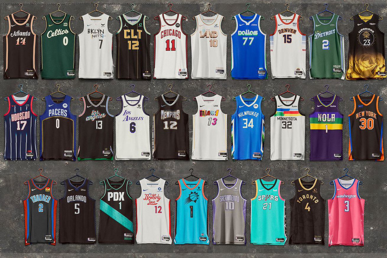
In the words of great philosopher and scholar Marshawn Lynch, “You know why I’m here.” It’s time to tier list the 2022-2023 City Edition jerseys. Explanations for each tier will be in the description.
S Tier: I’m adding these to my cart immediately and expect them to be shipped soon
These are HARD. Paying respect to the “Peachtree State,” the peach shades on the black jersey just look so sharp. In addition, the font is also awesome and it reminds me of the font the TV show “Atlanta” has. These are awesome and I would buy them immediately.
When in doubt, go back to where you came from. These City edition jerseys are an homage to the 1994-95 back to back championship winning teams. The vertical stripes mixed with the navy and red just always look awesome. The Rockets hit this one out of the park, by simply returning to their roots (we’ll come back to this thought later).
Memphis has recently leaned into the culture of the city more often. Their 2020 City edition jerseys are an homage to the legacy of Stax Records and soul music in the city, and these are an homage to rappers in the city of Memphis. The diamond texturing and gold accents are absolutely awesome, and the font on the jersey also is really cool. Memphis once again hits a home run with their city edition jerseys.
Oh yeah, these rock. Inspired by the 1996 All-Star game jerseys when the game was held in the Alamodome, and the color of the jerseys being so bright and vibrant really put this over the top. The pattern on the side inserts remains awesome, and once again the Spurs have killed this uniform release.
The flowers on the side of the jerseys will never get old to me. Paying homage to the cherry blossoms in the city, the pink and blue will always work well together. This is one of the best jerseys in the league this season.
I LOVE these jerseys. Representing the 22 native tribes in the state of Arizona, baby blue on a jersey never fails. Like, EVER. I really like the colors in between the numbers, a small and subtle thing that really makes it look cool.
A Tier: I’m buying this one eventually
Inspired by the Metroplex boom of 1973, what really does it for these jerseys is the font. It really does look retro and something straight out of the 70’s. The shade of green Dallas has and blue work together well, too. I’m in on these.
The Cavaliers jerseys are inspired by the Cleveland Metroparks, and I just love how clean this looks without being boring. The font on the jersey is really cool, and they manage to do the white jersey and make it look really interesting by the shade of what I think is mint coloring on the sleeves. Overall: awesome.
So I like these more than the Lakers jerseys because of the font and how creative the Clippers got. They never shy away from doing something different with their font on the jersey, and here they use script and highlight it with multiple colors that make it look like a stained glass window. It’s really cool and it works against the black jersey.
The Bucks are honoring Bronzeville, the first African-American neighborhood in the city with these uniforms, and they do a good job with it. The shade of blue is definitely a stark difference from what they normally wear, but the sides of the jersey look really interesting.
I think I really like these because of the color combination. This gray and purple really does work for the Kings, and it creates a clean and impressive look for Sacramento.
You can’t miss with black and gold. Just can’t.
B Tier: not my first choice, but I’d buy it still
These look better on the white jersey than they did the black jersey, honestly. The creativity of having each logo that appeared on a Heat jersey over the years is still cool, and allowing the players to choose which font they like for their number is a cool way to get player input. It’s a recycled idea, but fun nonetheless.
I am a sucker for script on a uniform. The Sixers font on their jerseys is one of the best of all the city edition jerseys, and it creates a throwback look. But the main detraction is this: it feels like the script is all they did. Like they pasted it on a practice jersey and called it a day. If they did more with this, it would be higher.
These jerseys are inspired by Mardi Gras, and I like them. The deeper shade of purple works better with the stripes, even though they’re still off putting. The font on the jersey remains cool. It passes.
I struggled with placing these. If you look at them from far away, they look pretty basic. However, zoom in and you see interesting things being done with the font, and a cool gradient on the sides of the jerseys. I’m in on it, they look cool, but it’s definitely not out there.
C Tier: If it were the last jersey on the rack, I’d buy it
Los Angeles Lakers
Remember what I just said about the Sixers not doing enough with the jersey? Yeah same here for the other LA team. It just feels…bland. They’re lucky I like the font and the colors they chose.
I mean, they’re alright. I don’t hate them, I just feel like this shade of green with the blue doesn’t work for me right now. The 3 stars above the D in Detroit are a nice touch though, I can appreciate that.
They look kinda boring to me. The sides of the jersey are cool, but these feel like I’m looking at a regular jersey that the Bulls wear often.
Just like Miami, the Nets are putting their original design on a white jersey. These feel boring, but the idea behind it is something I like. They just look kind of bland.
These are inspired by the Gainbridge Fieldhouse, but I kinda wish they did something different with the jersey. The sectioned off blue makes it look like they stitched two jerseys together, and it’s really weird looking. I like the idea, just would execute it differently.
Portland Trail Blazers
As a non-Portlandian, I had to go look up what PDX was, and given the story behind it, I think it’s cool. I probably wouldn’t have put it on the front of the jersey, but the color is a cool story and idea. Just put ‘Rip City’ or something on the front, and have PDX somewhere smaller.
(insert Druski “what do you mean by that” meme here)
D Tier: did you try? Be honest, did you try?
The Celtics saw the Bucks traditional home jerseys and were like, “these are mine now.”
Minnesota could’ve done so much more with these jerseys, instead of slapping the Vistaprint design on the jerseys with different colors. I get the story behind it, but do more with it.
These are just the regular jerseys, but in black.
…I like the side of the jerseys?
BREAKING: The Orlando Magic have decided not to participate in the City Edition jersey release.
F Tier: You will never see me dead or alive wearing this jersey
Whoever designed these will never see heaven. They will have to answer for their crimes at the pearly gates, and God will not be merciful.
Must See
-


American Football
/ 6 hours agoLudvig Åberg turns it around, shows why he’s a top 5 player in the world at RSM Classic
Ludvig Åberg during the second round of the 2024 RSM Classic. | Photo by...
By -


American Football
/ 8 hours agoJoel Dahmen keeps 2025 PGA Tour prospects alive by holing ‘most stressful’ putt of career
Joel Dahmen during the second round of the 2024 RSM Classic. | Photo by...
By -


American Football
/ 9 hours agoNelly Korda’s new swing thought helps soar her into contention at LPGA Finale
Nelly Korda on the 17th green during the second round of the 2024 CME...
By


