American Football
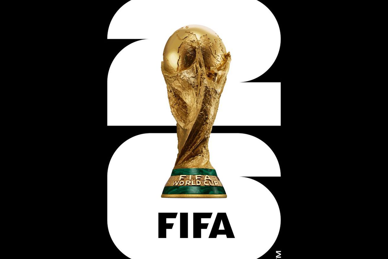
The 2026 World Cup logo is sad beyond belief
More in American Football
-


Pierre Gasly and Alpine F1 deliver ‘perfect’ qualifying session at Las Vegas Grand Prix
Photo by Mark Sutton – Formula 1/Formula 1 via Getty Images Alpine F1 delivered...
-


Franco Colapinto’s status for Las Vegas Grand Prix in doubt after massive crash in qualifying
Photo by Mark Thompson/Getty Images Williams F1 driver Franco Colapinto’s hard crash in qualifying...
-


Reed Sheppard’s diving behind-the-back assist is NBA’s best pass this season
The Houston Rockets rookie made an incredible play against the Trail Blazers. Reed Sheppard...
-


Tyrese Haliburton is broken for Pacers, and he says he doesn’t have any answers
Haliburton’s latest interview is a painful reminder of his diminished play over the last...


